
Tiles for the Thaw: Inspiration from a Hudson Valley Spring
Every spring, color feels newly possible again.
After months of muted winter tones, the Hudson Valley begins to soften into pale greens, damp earth, flowering branches, washed-out skies, and sudden bursts of color: daffodil yellow, tulip red, lilac purple, mossy stone, fresh leaves almost fluorescent in the afternoon light. The landscape becomes layered again. Texture returns. Contrast returns. Pattern returns.
Lately, we’ve been thinking about how closely tilework mirrors that seasonal rhythm.
Tiles have always borrowed from nature. Historic ceramic traditions across Morocco, Portugal, Mexico, Italy, Turkey, and beyond are filled with floral geometry, water motifs, leaf forms, vines, suns, waves, and repeating organic shapes. Even the most structured patterns often begin with something botanical: petals, stems, seeds, or shifting landscapes abstracted into repetition.
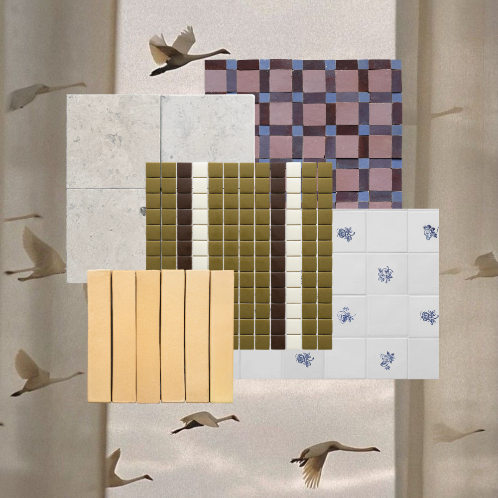
This spring, we’ve been collecting favorite tiles alongside photographs of the season itself — layering glazed surfaces over budding trees, muddy garden paths, early blooms, river reflections, and soft green undergrowth. The collages become small studies in color and texture: how a celadon tile echoes new leaves after rain, how terracotta pulls warmth from bare branches, how faded blue encaustic patterns feel almost identical to the Hudson River under cloudy April light.
What makes tile so compelling is its permanence against nature’s constant change. A garden lasts for a season; tile preserves a feeling of that season indefinitely. One captures movement, the other memory.
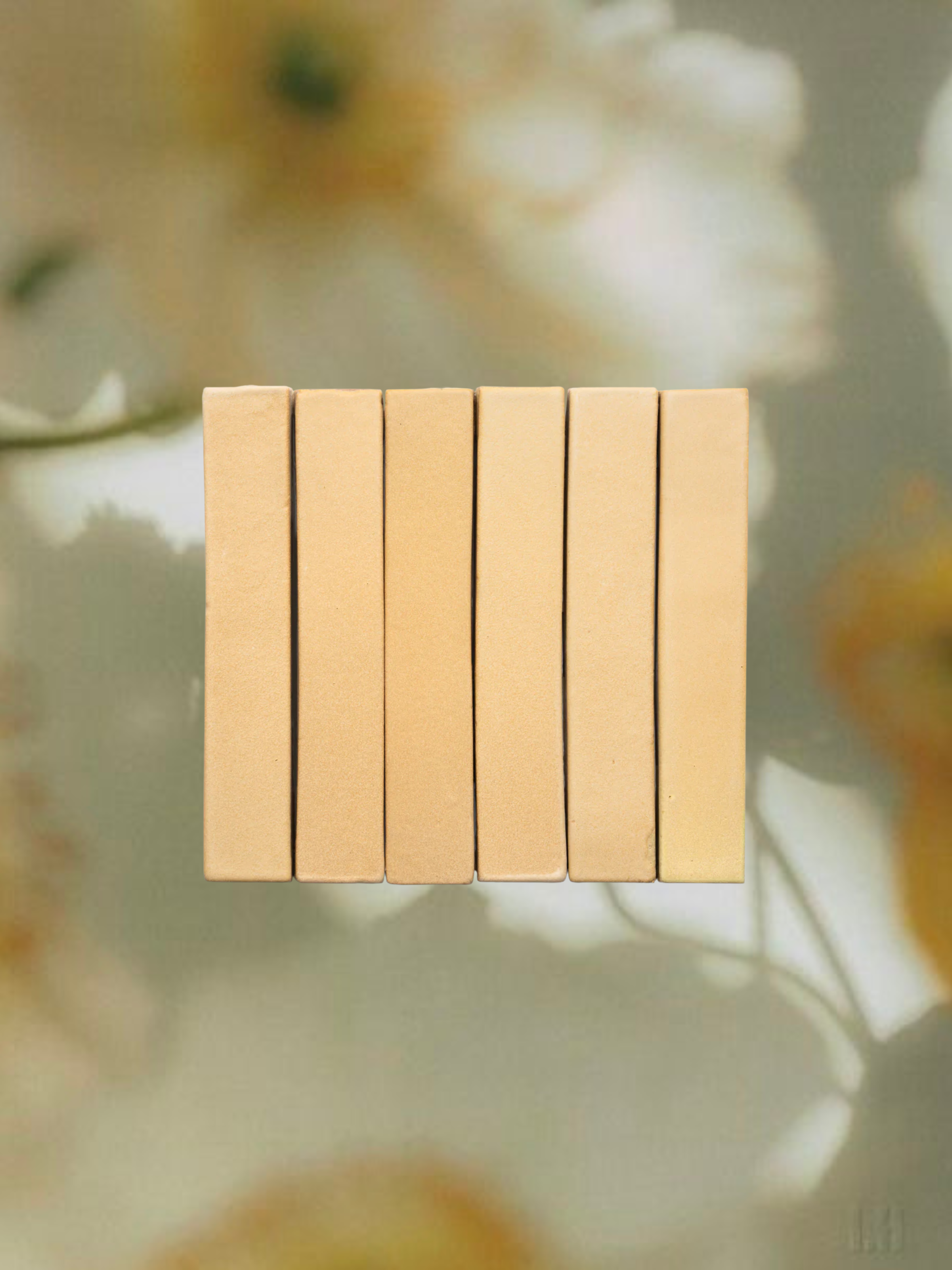
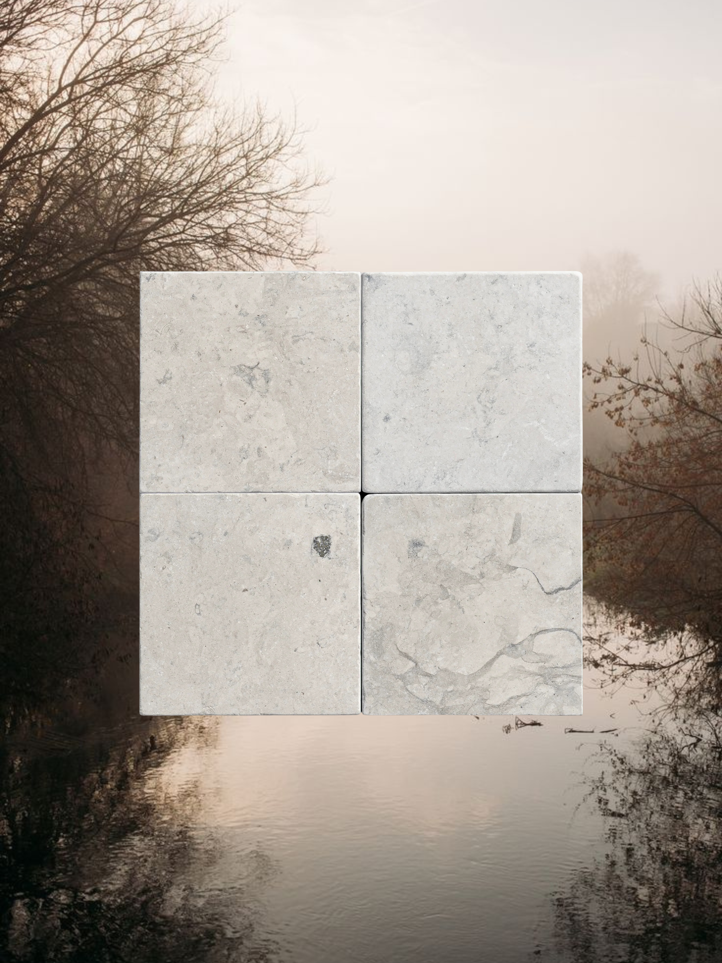
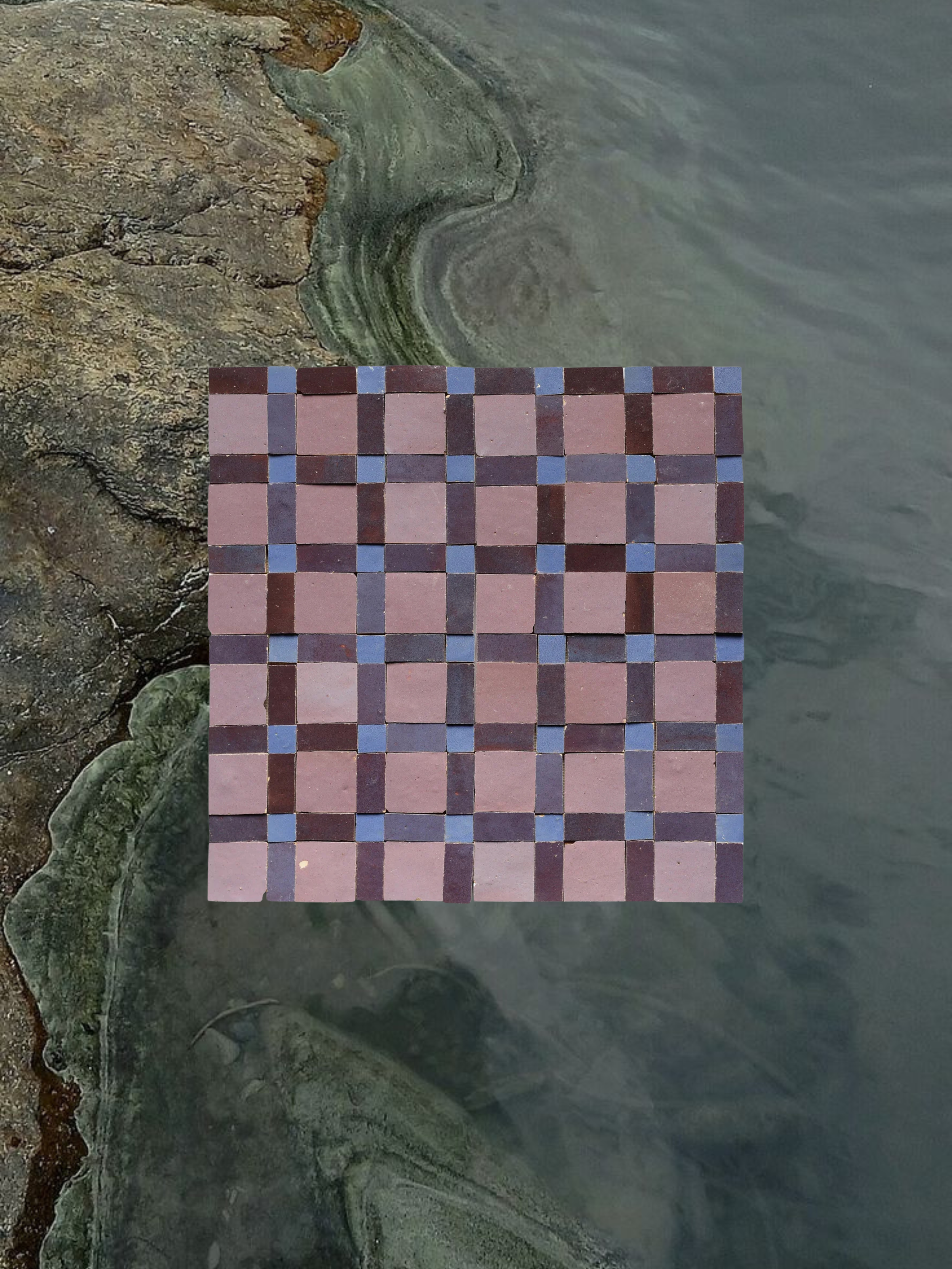
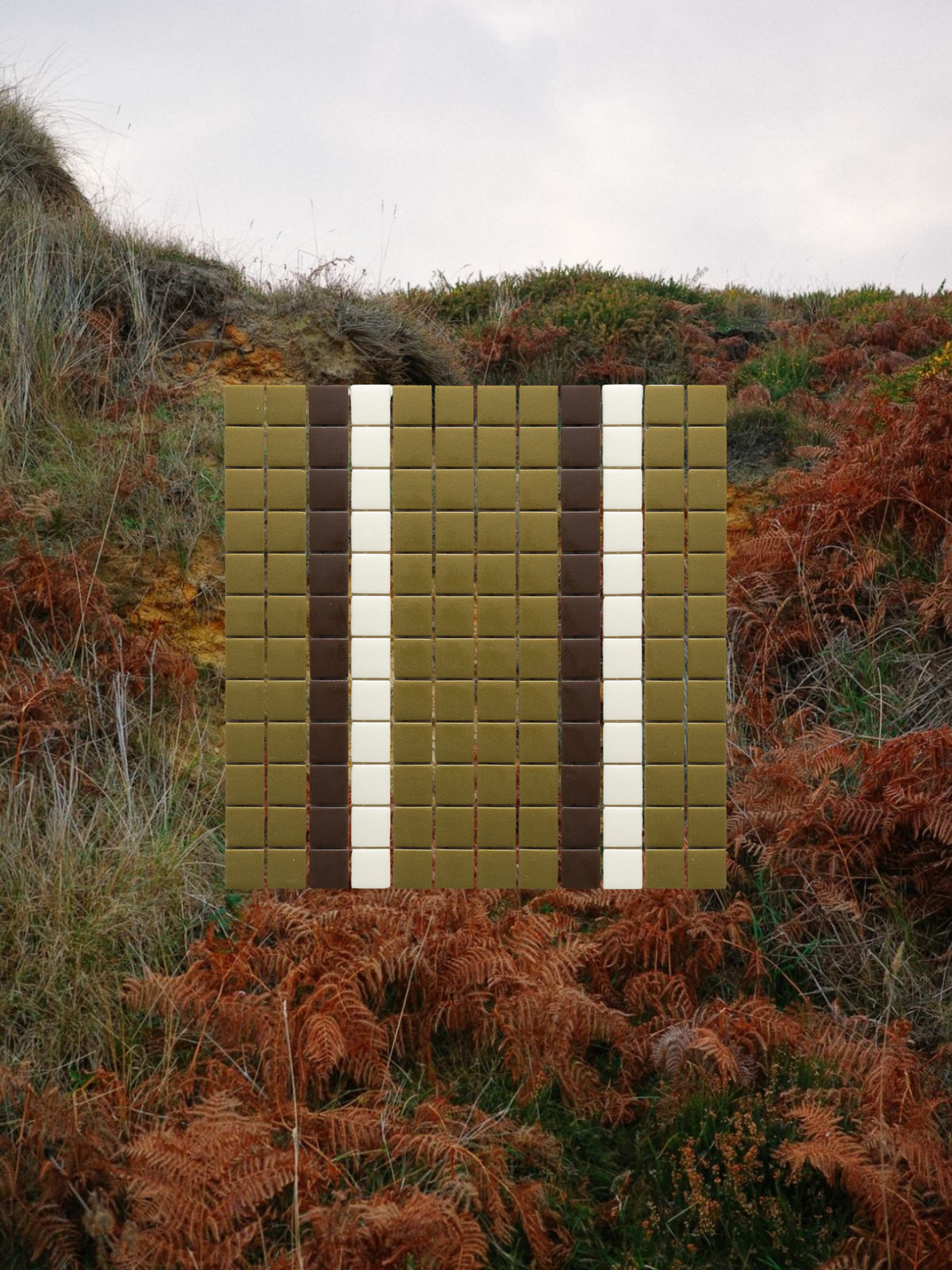
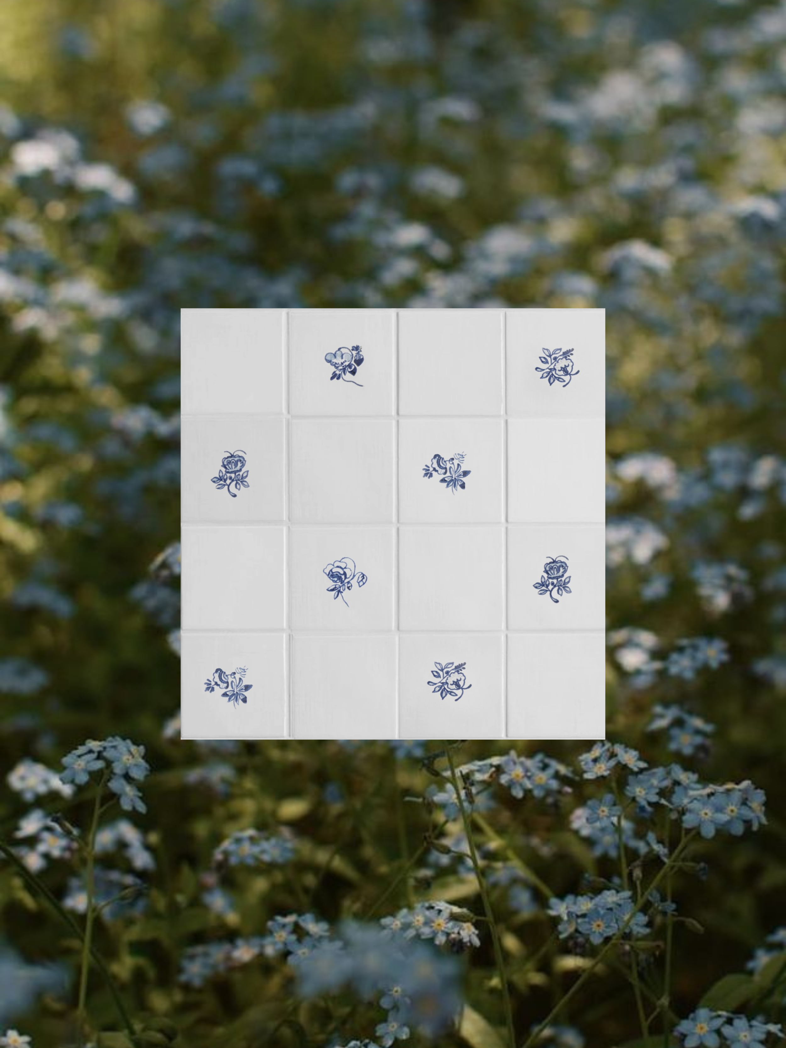
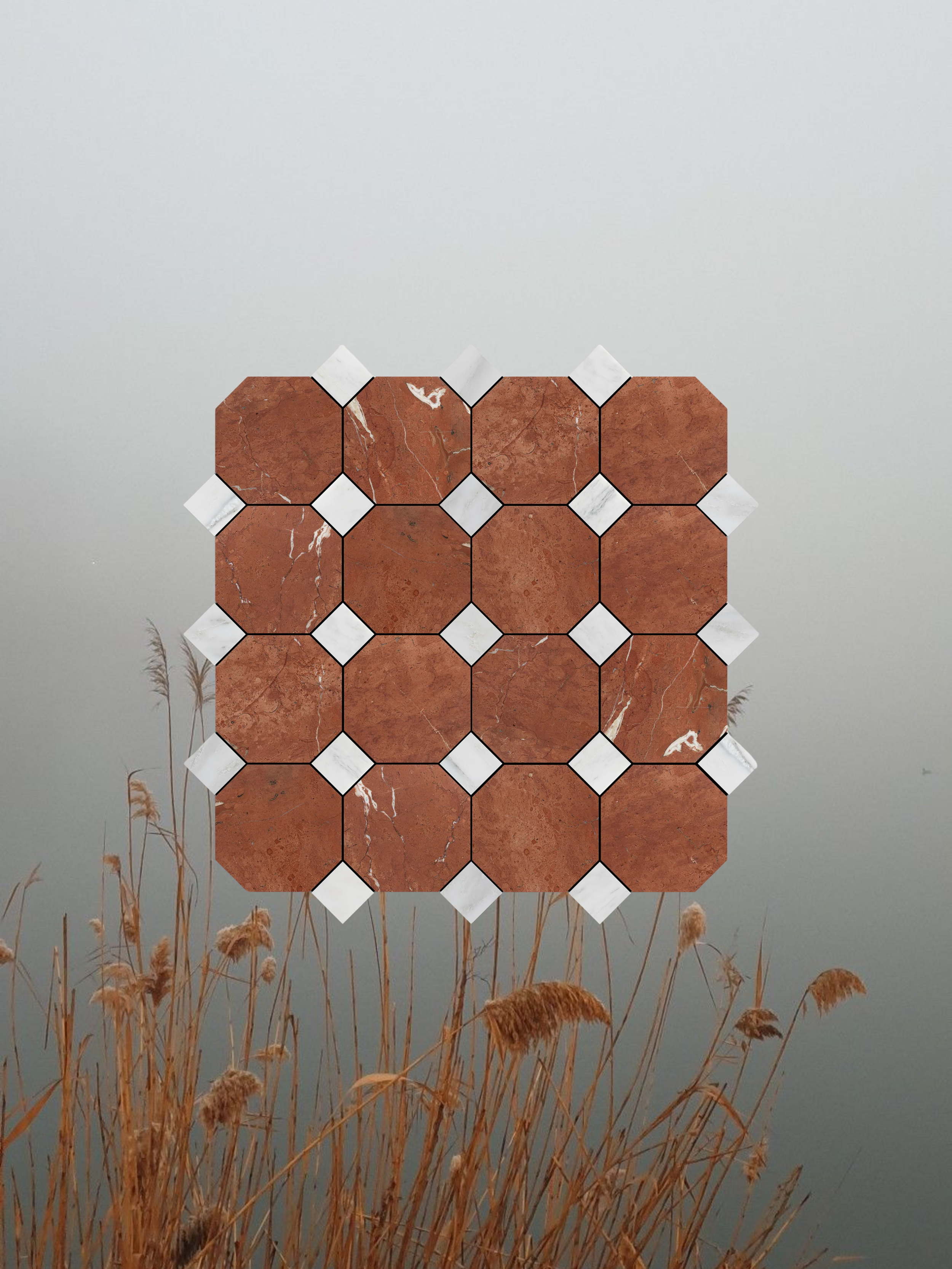
This collection draws from the quieter colors of a Hudson Valley spring: (1) buttery narcissus yellows softened by filtered garden light and the first pale greens of budding branches, (2) pale limestone and chalky cream tones that resemble mist rising off the Hudson River in the early morning, (3) muted hyacinth purples and soft lavender checks against cool stone gray, like woodland flowers emerging through damp earth and rock, (4) mossy greens layered with deep mineral textures that echo rain-soaked riverbanks and shaded forest paths, (5) delicate blue floral details reminiscent of bluebells and tiny wildflowers appearing quietly one by one along the edges of trails, and (6) earthy terracotta, dried grasses, and hazy gray skies inspired by foggy spring mornings before the Valley fully turns green.These combinations appear everywhere in spring if you begin looking closely enough. In bark. In puddles. In seed packets. In greenhouse tables. In old garden walls overtaken by lichen.
There’s also something especially beautiful about the imperfections shared between handmade tile and the natural world. Slight variations in glaze resemble shifting petals or uneven soil tones. Cracks, fading, mineral blooms, and texture all feel more alive than machine-perfect surfaces. In that way, tile behaves almost like a preserved landscape — fired earth carrying traces of water, minerals, heat, and time.
Our spring collages are less about interiors alone and more about atmosphere: the relationship between built spaces and the landscapes surrounding them. A tile doesn’t exist in isolation. It changes depending on the season, the light, the weather outside the window, the flowers nearby, the color of the sky at dusk.
Spring reminds us that color palettes are rarely invented. More often, they are observed.
Nature has already done the composition work for us.